Choosing a fall color palette is less about following trends and more about identifying the mood you want your space to carry through the season.
Some palettes lean moody and dramatic. Others feel soft and sun-drenched. A few blend the unexpected with the classic in ways that genuinely surprise.
These 10 fall color palette ideas range from earthy neutrals to rich jewel tones, each one designed to bring coziness and modern style into your living spaces.
1. Ink Black, Cognac, and Sandstone
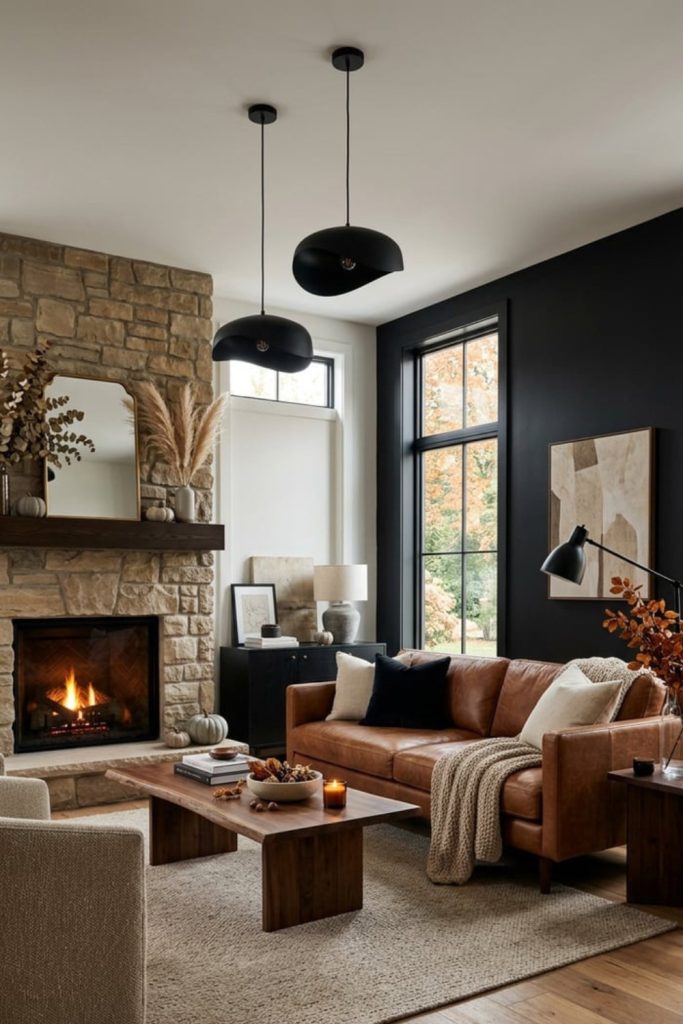
This palette is for you if sophistication and moodiness top your design priorities. Ink black serves as a bold anchor, creating instant drama in any room.
Cognac, that rich amber-brown, introduces warmth without competing for attention. Sandstone softens the contrast, acting as the perfect mediator between dark and warm.
Where it works best: Living rooms with leather seating, matte black light fixtures, and natural stone accents.
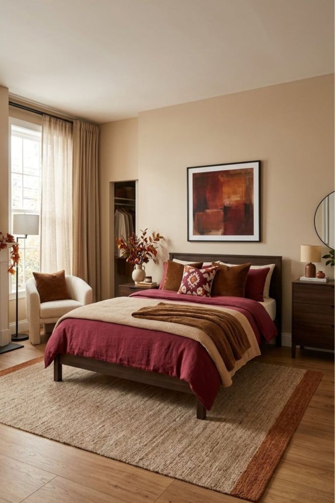
2. Amber, Mocha, and Blush Pink
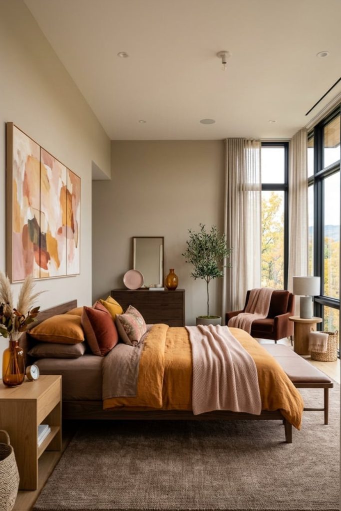
This is a palette that catches people off guard, and that is exactly why it works. Amber and mocha are undeniably autumnal, but adding blush pink introduces a softness that feels playful without being precious.
You get warmth from the amber, depth from the mocha, and a gentle lift from the blush. Together, they create an atmosphere that feels cozy yet unexpectedly fresh.
Best rooms for this combo: Bedrooms, reading nooks, and dining spaces where you want conversation to flow easily.
3. Espresso, Maple, and Champagne Beige
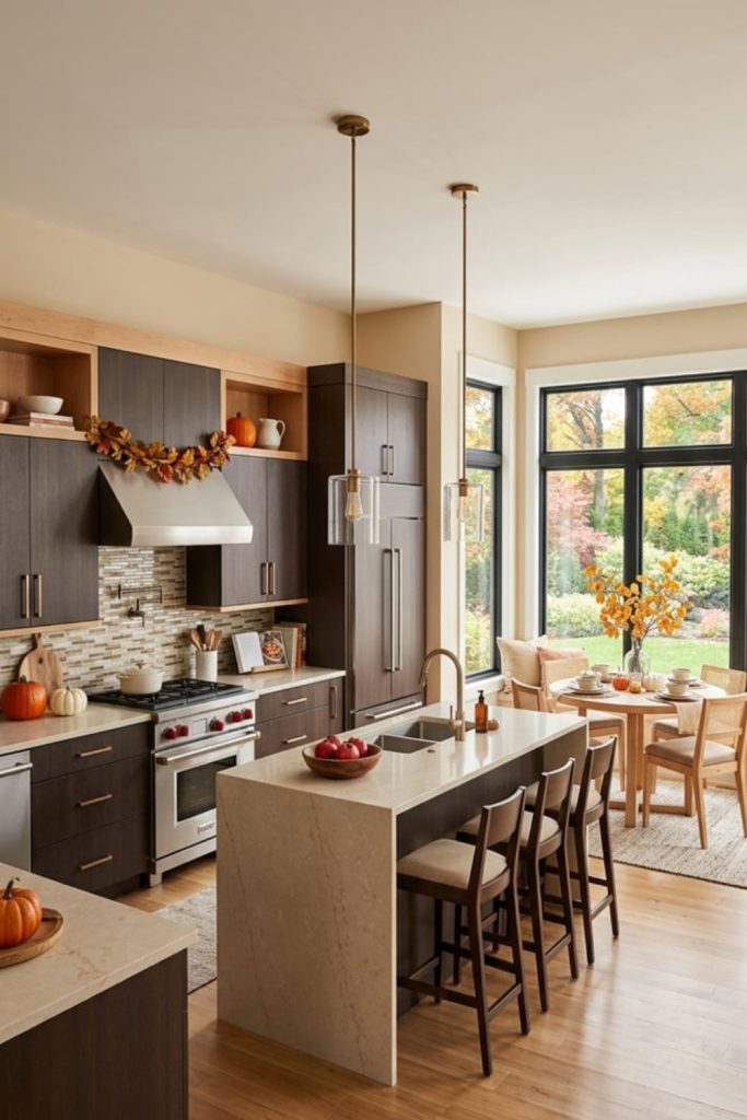
Think of your favorite fall latte translated into a room. Espresso brings rich, dark intensity.
Maple delivers that signature autumnal warmth in a vibrant, burnished orange-brown. Champagne beige lifts everything with an airy, creamy glow.
Ideal spaces: Kitchens, breakfast nooks, and home offices where you want an inviting, grounded energy.
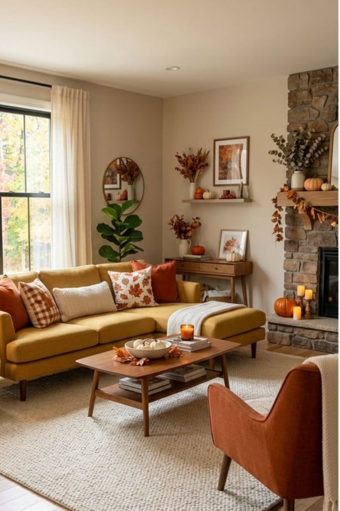
4. Terracotta, Dark Brown, and Cream
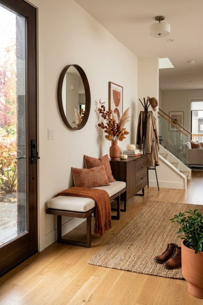
Terracotta is one of those colors that practically defines fall, and when you pair it with dark brown and cream, you get a combination rooted in the earth itself. This palette feels organic, warm, and genuinely timeless.
Dark brown provides structure and weight. Cream opens the space up and prevents the warmer tones from overwhelming a room. Terracotta sits between them, radiating that sun-baked, desert-at-dusk quality.
Where this shines: Living rooms, entryways, and bathrooms where natural materials already play a role.
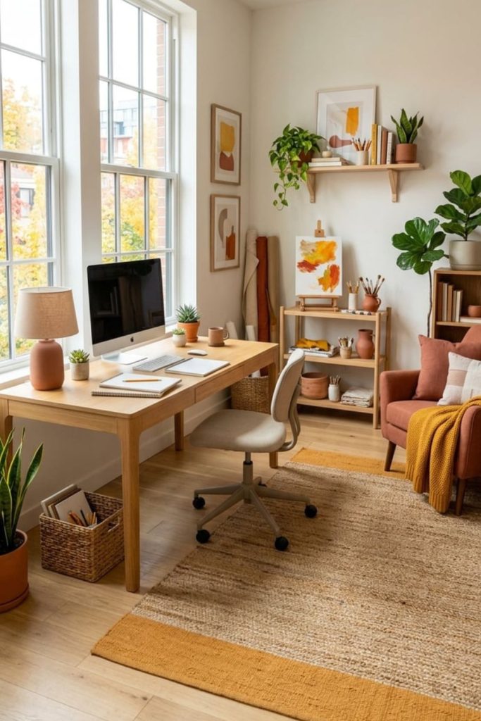
5. Olive Green, Camel, and Warm Taupe
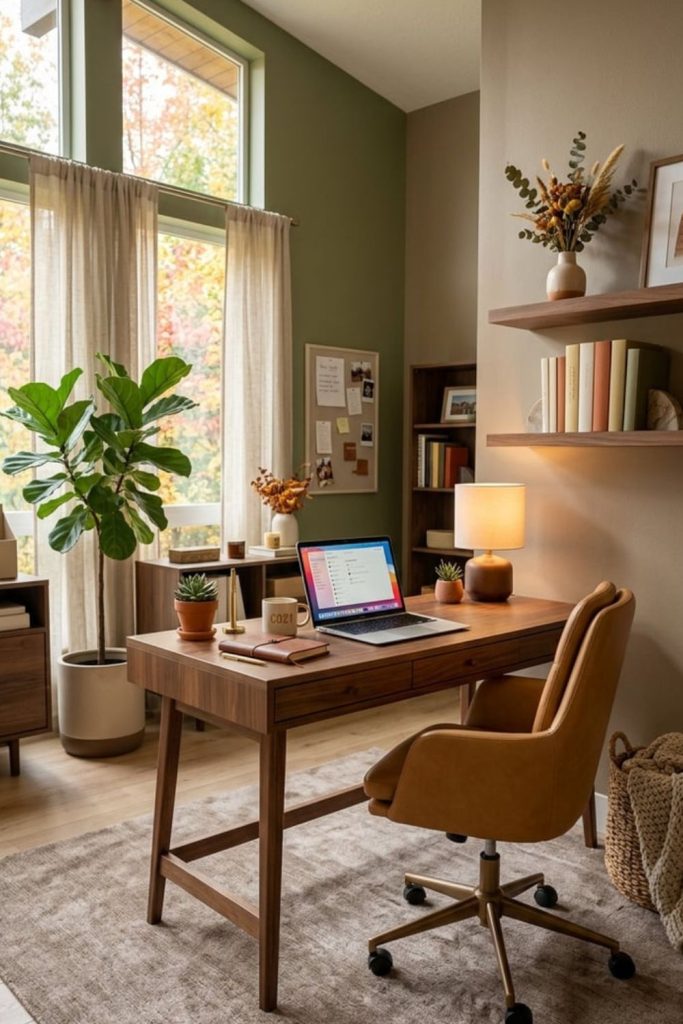
If your taste leans toward quiet sophistication, this palette is your match. Olive green brings nature indoors without being loud about it.
Camel adds a classic, polished warmth. Warm taupe ties them together with understated elegance.
Works beautifully in: Home offices, dens, and bedrooms that prioritize calm over stimulation.
6. Burgundy, Plum, and Chestnut Brown
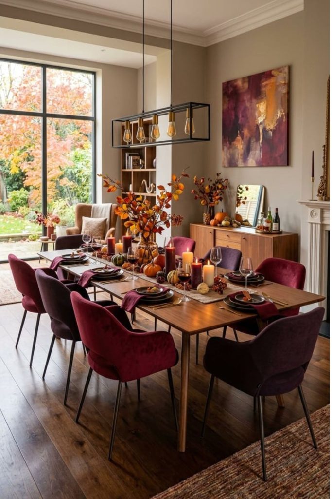
This is the palette you reach for when you want a room to feel rich, dramatic, and deeply autumnal. Burgundy carries the weight of a fine wine.
Plum introduces a purple undertone that adds complexity. Chestnut brown grounds the entire scheme in something familiar and warm.
Best suited for: Dining rooms, powder rooms, and intimate sitting areas where mood matters.
7. Mustard Yellow, Burnt Orange, and Cream
This is the palette that says “fall” the moment you walk into a room. Mustard yellow radiates optimism and energy.
Burnt orange delivers that deep, harvest warmth. Cream prevents the combination from becoming overwhelming by offering visual relief.
Ideal spaces: Kitchens, family rooms, and front porches where you want an energetic fall welcome.
8. Rust, Sage, and Oatmeal
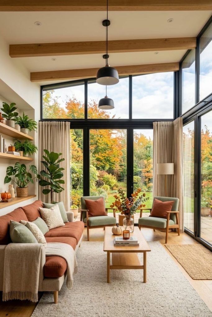
Rust and sage make one of the most naturally harmonious color pairings in the fall spectrum. They mirror what you actually see outside during autumn: warm, oxidized leaves against still-green foliage.
Oatmeal rounds out the trio as a soft, grounding neutral. This palette feels organic and modern at the same time.
Best in: Bedrooms, sunrooms, and open-plan living spaces where natural light plays a role.
9. Cranberry, Corduroy Brown, and Warm Beige
Cranberry is one of fall’s most underused colors, and it deserves more attention. It brings a festive energy that is not as expected as orange or red.
Corduroy brown (think the actual texture and the warm mid-brown tone) introduces nostalgia and tactile richness. Warm beige keeps things calm and approachable.
Perfect for: Bedrooms, bathrooms, and living rooms where you want warmth without heaviness.
10. Saffron, Clay, and Soft Linen
Saffron is warmer and more golden than standard yellow, giving it an almost exotic quality. Clay brings that burnt, reddish-brown earthiness.
Soft linen, a barely-there warm white, ensures the palette stays airy and approachable. This combination feels sun-drenched, as if a late October afternoon filtered through your windows and stayed.
Great for: Dining rooms, kitchens, and creative spaces that benefit from warm, energizing light.